9 Ways to Give Your Smiirl Counter Superpowers
August 29, 2021
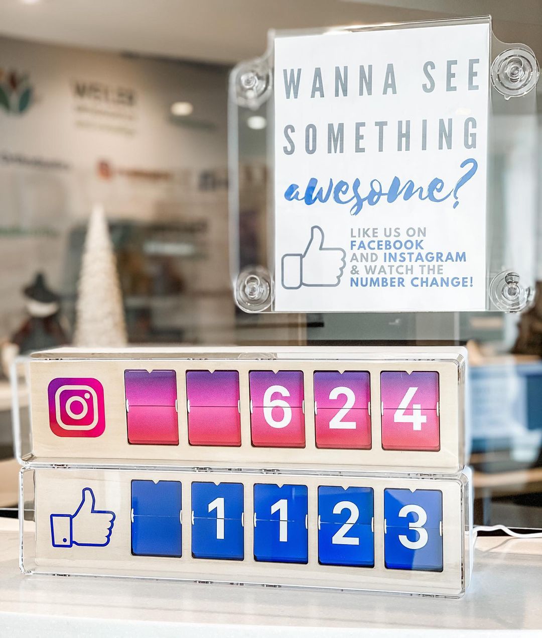
Your Counter is more than a Wi-Fi connected plastic box 🙃 It’s an entire experience. How you promote it can have a big impact on the way your customers interact with your business on social media.
When you are trying to get people to follow your pages and get the most out of your Counter, the focus is squarely on how you make it look inside your place of business.
New followers are the lifeblood of your business's social media presence. You have to grab passersby and visitors' attention to make them want to follow you. Your Counter display has to get them over any hesitation to push the "Follow" button.
The first secret is to be really thoughtful about where you place it. The rest lies in using few words and creativity along with beautiful design. The objective: make a striking first impression, so your setup can leave a long-lasting impression on customers.
Here are 9 ways that work best to make customers and visitors follow you and boost your social media pages.
1. Make a great window display
A well-designed window display encourages passersby to enter your store and can pique anybody's curiosity. If you know how to handle it, writing on you window can be a really cool way to engage with people.
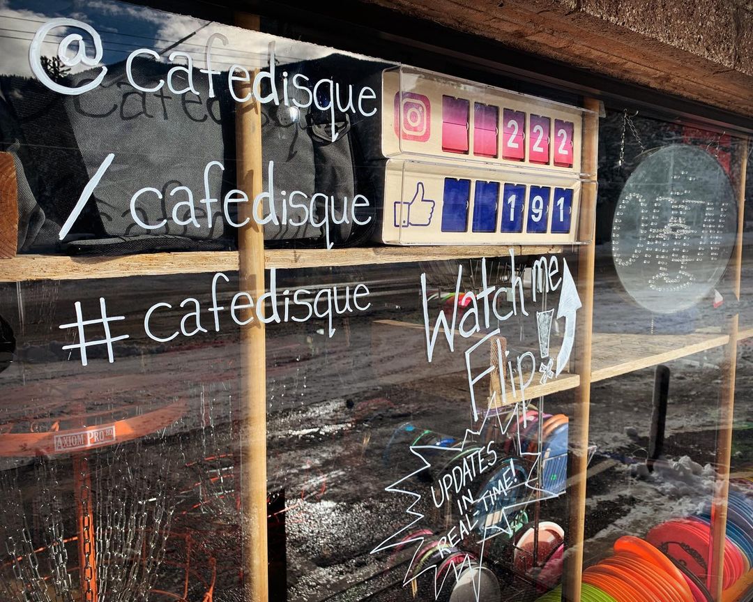
But putting out your best products is always the best way to show credibility and drive foot traffic.
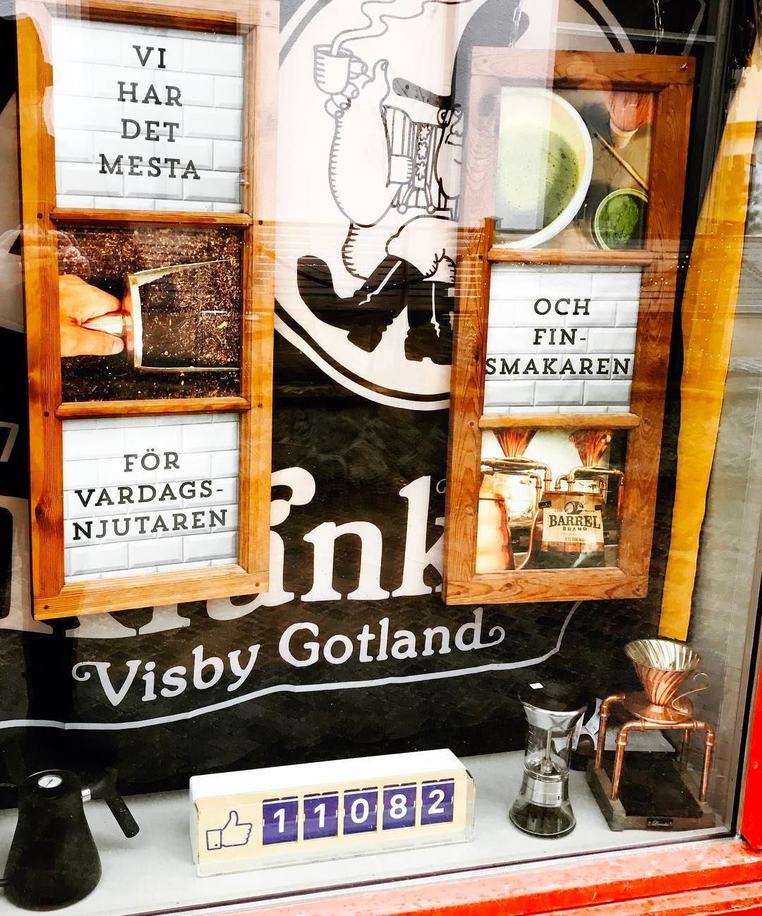
2. Take advantage of Your Counter on your point of sale
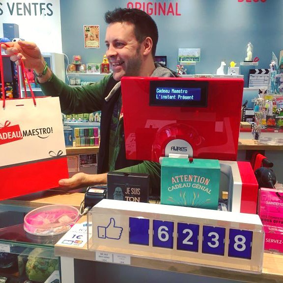
Putting your Counter at the checkout area is a sure way to get every customer to notice your social media presence and make them feel (literally) more connected to your brand.

People will get curious and ask questions about the device, creating the perfect opportunity for a quick chat. All this can only make your payment experience more memorable.
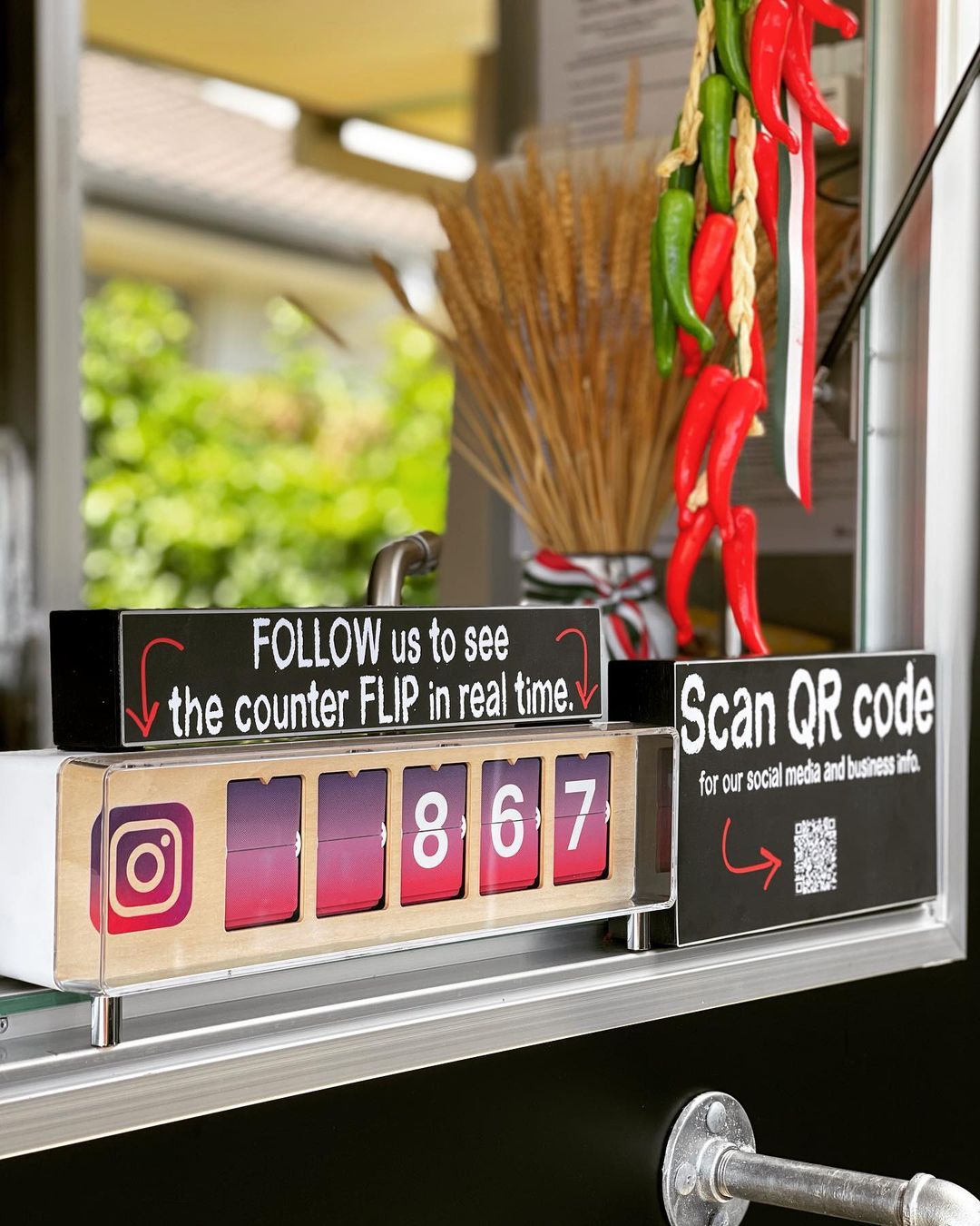
3. Use QR codes
Display your social media handle, brand hashtags and QR code to drive your shoppers directly to your pages. After Covid a lot of businesses started using them to share menus or any kind of information, this widespread adoption makes the case all the more compelling for your Instagram and Facebook pages.
The are tons of tools out there, one of our favorite being QR Code Tiger.
4. Create a memorable sign for your Counter
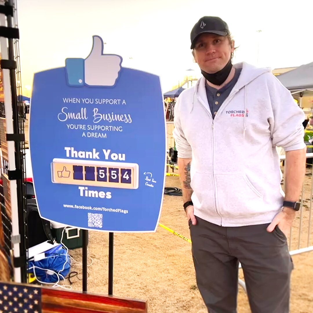
Sometimes our Counter needs a bit of explaining, educating shoppers about its magic can only be a great idea! And you should definitely go beyond the mere technical explanation, people are sensitive to messages of support and encouragement, use one to makex/ them all the more likely to pull out their phone!
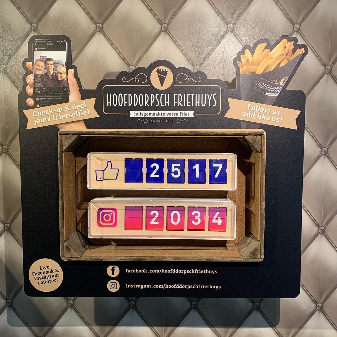
This solution will require a bit of an investment on your part. First to create a beautiful design that will fit your branding and then work with a sign printer. But done right it can be an amazing addition to your store!
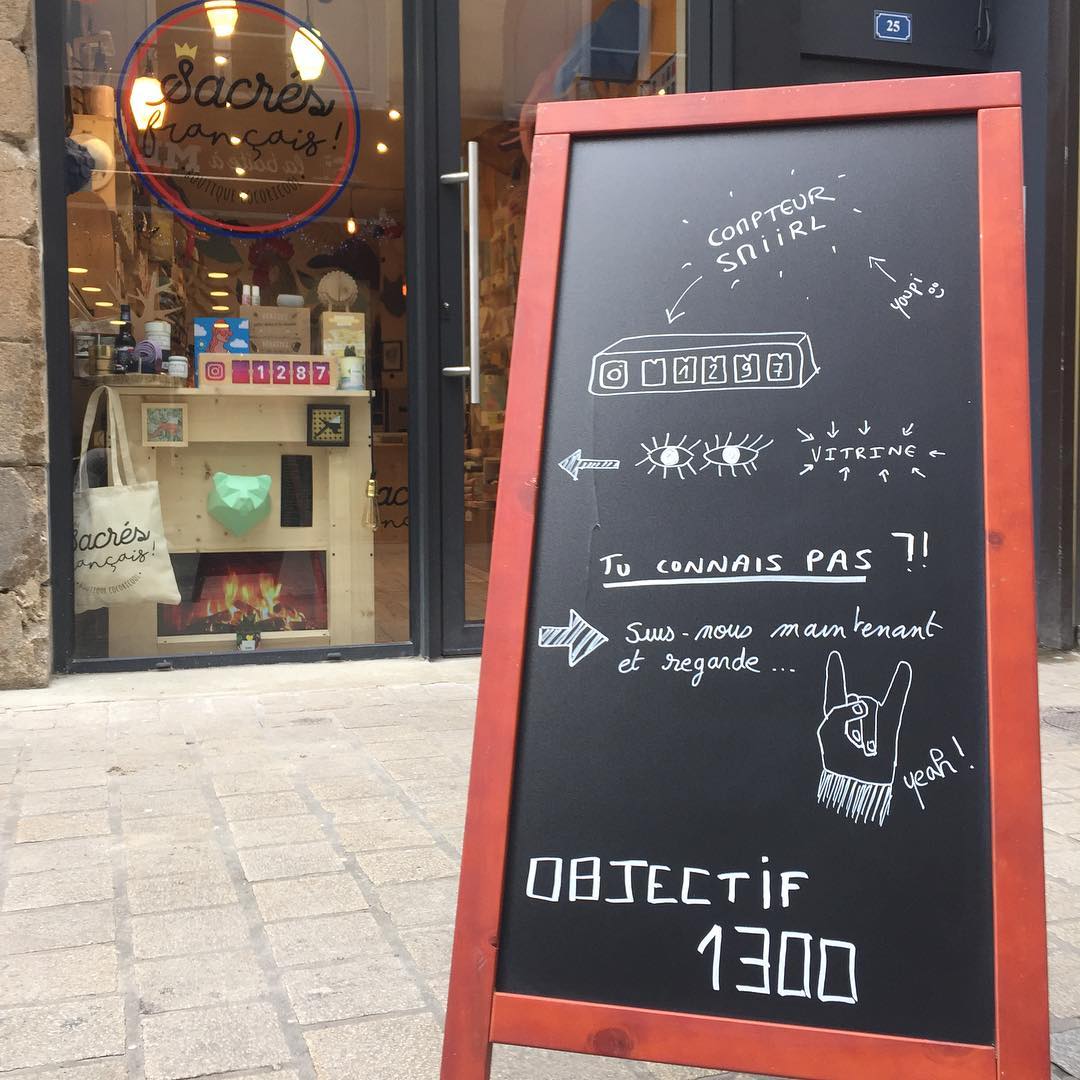
5. Add a sandwich board sign
When it comes to sandwich board signs, first impressions are important. Make a good one by keeping your message engaging, and don’t be afraid to get creative.
P.S. Check with local authorities on signage regulations. Psst'.. some clients only use them on weekends when the sign inspector is off but when foot traffic is highest.
6. Say it with flowers
Because they always win. The abundance of flowers will attract customers’ eyes, so everyone knows where your Counter is. With a truly unique and eye-catching sign, you will quickly draw even more people to your social media pages. The flowers will more than pay for themselves 😊
Ok we can hear some of you thinking, “Guys won’t appreciate that.” Remember guys are often the ones maintaining their own yards. Out with the clichés 🙈
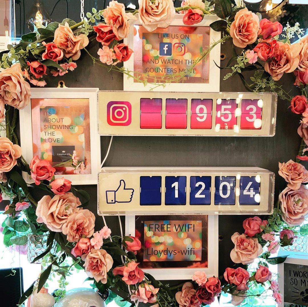
7. Encourage Likes with a lightbox
You can find these little boxes in restaurants, in decoration boutiques, in your friends’ living-room, pretty much anywhere. But in the case of our Counter, the duo works perfectly. The message displayed on the light box can be customized thanks to the set of letters and signs you get when buying one. As presented on the example above/below, you can encourage your clients and friends to like your page in order to make the counter moves its lil flaps. The first box makes the second box move, what a perfect cycle.

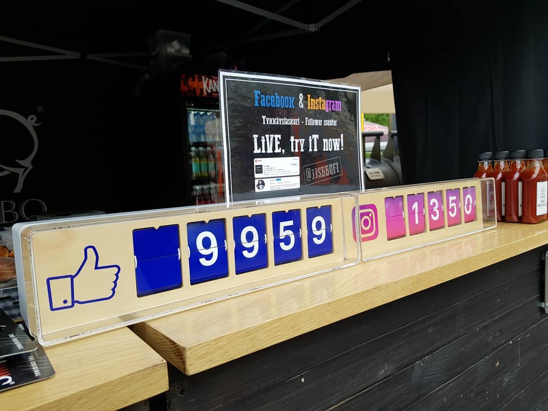
8. Get creative with a smaller panel
This smaller type of signage can help your business achieve your advertising goals with a more limited budget. It can be as easy as printing out a standard paper page and inserting it into a standard plastic stand. Standard stuff but cool results 👍
It's all about the look: add beautiful colors to your signage to make it even more appealing. Select carefully to align with your brand. Find the right elements and messages to make your sign ridiculously effective at getting attention to your Counter.
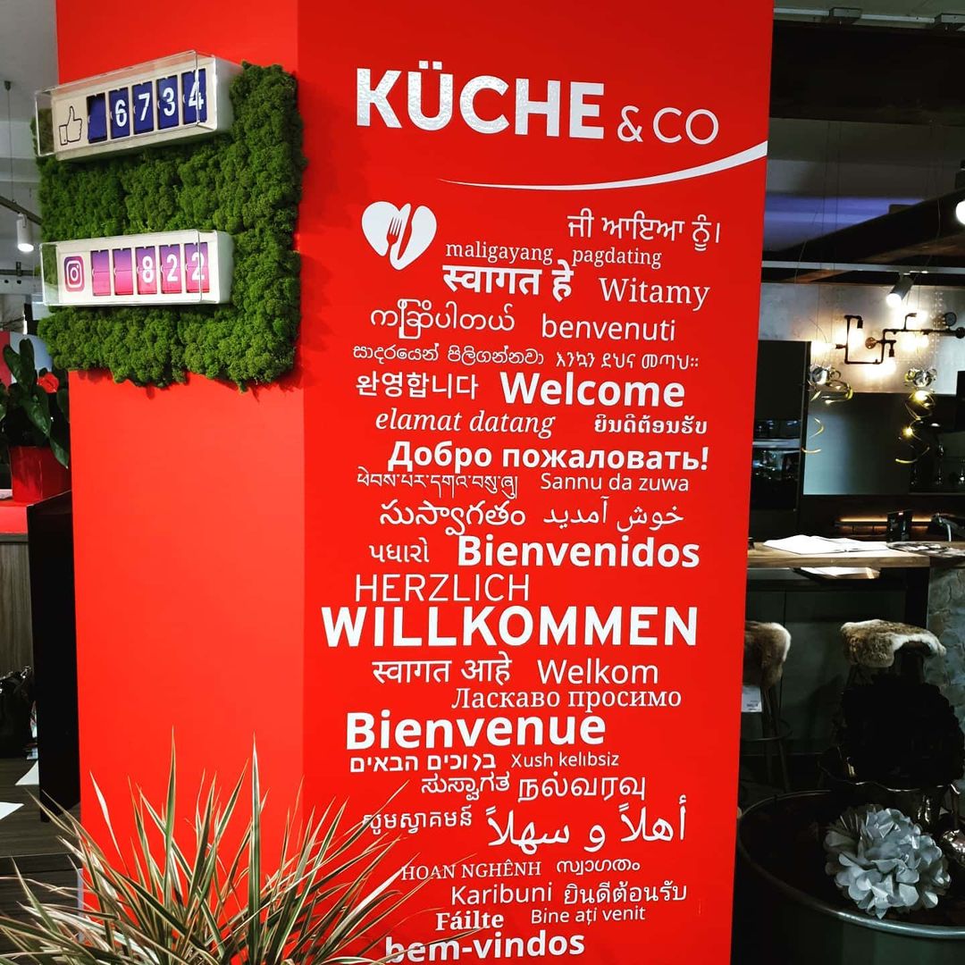
9. Go big with a wall sign
A beautiful wall sign can speak volumes. This is your chance to create a fascinating and eye-catching presentation for your Counter. Wall signs are not that common but carry a special presence inside your place of business.
Research literature shows that up to half of shoppers check out stores on impulse – and once inside your store, there is, obviously, a raised likelihood of people buying AND following your social media pages!
That's about it for now, we hope you liked some of our suggestions. We just wanted to get you thinking about the right place for your Counter. Not everything has been presented, and the best idea may be the one you are about to invent!
The Counter always bring a magic touch, but with the right setup it can steal the show!
What do you think? Have you thought of anything different? Any questions or comments? Let us know!
P.S. For more setup ideas checkout #smiirl on Instagram, there is an ocean of content!
